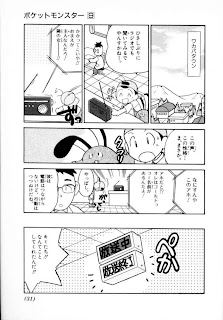
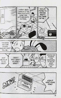
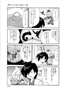
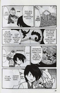
 Not needed, but here's the Chuang Yi page anyways:
 Straightening
Now, if you have read through the raws, you may have noticed that the not-so-diligent scanner didn't straighten the pages. We'll have to do that for ourselves.
This method isn't recommended for proper raws (like, raws I've scanned myself) because it changes the canvas size. However, the difference is only visible to people with OCD, like me, so it's worth the efficiency. If you do end up doing cleaning and editing in the future, the normal way is just to rotate and proportionally scale the image; nevertheless, this way is pretty much instant compared to the normal way.
Open up PS and right-click the eyedropper tool (I). Select the ruler tool:
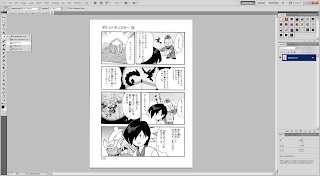 Draw a ruler vertically or horizontally, it doesn't matter. Stick as close to the line you choose as your reference as much as possible. You may have to disable Snap under View -> Snap (Shift+Ctrl+;).
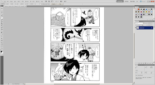 Press the "Straighten" button on the second button from the top, then it should rotate and crop the page for you. If it doesn't look right, try again using a different edge.
 Cloning
Now, sometimes, there might be text that are in places that you can't just paint over. Take, for example, this text bubble in the flashback. I would actually accept the page if you don't do it at all, since it's not very significant, but if you have enough free time, you could try cloning it.
Since we're going to do work on the background, I would recommend that you clone the layer first.
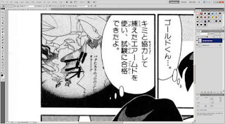 This guide by the immortal scanlation group Storm In Heaven pretty much covers it all, so I'm not going to repeat them. Select the clone stamping tool (S), then where you want to clone while pressing down the Alt key. The brush works exactly like a normal brush, except that it copies over the image from where you selected. The location of where you copy from moves along with your brush.
I recommend that you choose from just left of where the text in the flashback bubble clips into the larger bubble for the flashback (red rectangle). Starting from the green rectangle, work your way up. Don't be afraid to choose new sources for clone stamping.
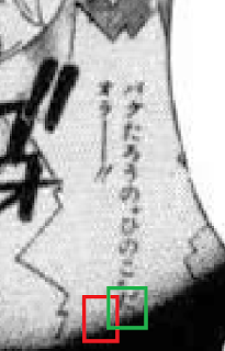 Eventually you'll clean all of it:
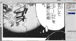 And now you can clean and typeset like normal:
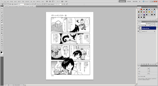
New to Photoshop CS5 is a feature called content-aware fill. It only really works well in certain cases. You can try it out, but good ol' clone stamp is good enough.
When to Clone Stamp
Don't do clone stamp every single time. For example, the title on the page used for Typesetting 101 would've taken me 15-30 minutes to clean. Use your judgment to decide whether to put the translation next to it or clean it with clone stamp.
Merging Spreads
One final point I would like to make is about 2-page spreads. As of right now, don't merge them yourselves. Just treat the two pages separately. I'll merge them after you submit your chapter to me.
Final Test
Alright, take a shot at this final test (page 31). Straighten and clean the broadcast sign, then typeset it.
In regards to styling, use the font Champagne & Limousines (because it's a narrow font, it can fit better inside the vertically-orientated box) for labels that display the location, italicized WildWords for announcement text, and Syntax LT for the broadcast sign. All of them should have been included in the font pack. I should have the styling guideline hammered out before we start so that our releases can be more or less consistent:
