I was looking over the list of chapters that still need to be done, and found Aerilic's chapter 142. It seems that I've forgotten about Aerilic's submission for almost a month, probably because I didn't see his comments. So from now on, I'm going to enforce the rule of using e-mail to submit. You can still post in the comments if you want others to review your chapters, but e-mail is mandatory. It's a problem with me and not you guys.
Oh, and chapter 142 passed, by the way.
| RGBY | GSC | RS | FRLG | E | DP | ||||||||||||||||||||||||||||||||
| Dragon Guard Scanlations | Pokemon Special Restoration Project | Chuang Yi | iNet | CY | /a/nonymous scanlations | ||||||||||||||||||||||||||||||||
| 01 | 02 | 03 | 04 | 05 | 06 | 07 | 08 | 09 | 10 | 11 | 12 | 13 | 14 | 15 | 16 | 17 | 18 | 19 | 20 | 21 | 22 | 23 | 24 | 25 | 26 | 27 | 28 | 29 | 30 | 31 | 32 | 33 | 34 | 35 | 36 | 37 | |
Sunday, December 12, 2010
Wednesday, December 8, 2010
Pokemon Special vol 10 (ch 117 - 129) release
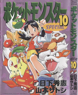 I presume that everyone is busy taking their finals?
Pokemon Special vol 10 (IF)
Pokemon Special vol 10 (MU)
Tuesday, November 30, 2010
Pokemon Special vol 1-8 (ch 1-103) batches from DGS
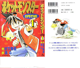 I had to rename the pages first because they were just too messy.
Pokemon Special vol 1 (IF)
Pokemon Special vol 2 (IF)
Pokemon Special vol 3 (IF)
Pokemon Special vol 4 (IF)
Pokemon Special vol 5 (IF)
Pokemon Special vol 6 (IF)
Pokemon Special vol 7 (IF)
Pokemon Special vol 8 (IF)
Pokemon Special vol 1 (MU)
Pokemon Special vol 2 (MU)
Pokemon Special vol 3 (MU)
Pokemon Special vol 4 (MU)
Pokemon Special vol 5 (MU)
Pokemon Special vol 6 (MU)
Pokemon Special vol 7 (MU)
Pokemon Special vol 8 (MU)
Thursday, November 25, 2010
Pokemon Special vol 9 (ch 104 - 116) release
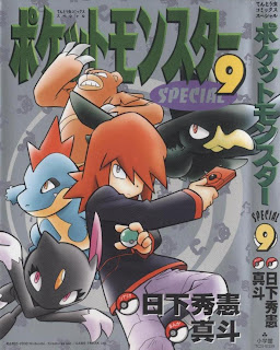
Oh, finally. Chapter 113 had to be cursed or something. Volume 10 will come soon as well.
Pokemon Special vol 9 (IF)
Pokemon Special vol 9 (MU)
Here's the group page on MU, by the way. I hope you guys won't mind if I listed the releases as joint releases.
Tuesday, November 16, 2010
Pokemon Special vol 13
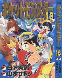
9 and 10 should be finished and released within a week.
- Chapter 155: VS. Kabutops -Simon
- Chapter 156: VS. Noctowl - Simon
- Chapter 157: VS. Mangemite - Simon
- Chapter 158: VS. Scyther -link
- Chapter 159: VS. Pupitar - Chern
- Chapter 160: VS. Porygon2 - Chern
- Chapter 161: VS. Entei - Chern
- Chapter 162: VS. Hitmontop - link
- Chapter 163: VS. Bellossom - Aerilic
- Chapter 164: VS. Slowking - kuromitsume-kun
- Chapter 165: VS. Lugia & Ho-oh (Part 1) - Black Star
- Chapter 166: VS. Lugia & Ho-oh (Part 2) - kuromitsume-kun
Wednesday, November 3, 2010
Pokemon Special vol 12
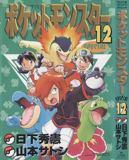 Strangely enough, 10 was finished before 9, but I'll wait till they both get completed before making the final preparations
- Chapter 143 : VS. Cleffa & Igglybuff -Pikachu
- Chapter 144 : VS. Swinub - Pikachu
- Chapter 145 : VS. Sandslash -Shincario
- Chapter 146 : VS. Lugia (Part 1) -Shincario
- Chapter 147 : VS. Lugia (Part 2) - -reichiru-
- Chapter 148 : VS. Lugia (Part 3) - -reichiru-
- Chapter 149 : VS. Kingdra - -reichiru-
- Chapter 150 : VS. Chinchou - Simon
- Chapter 151 : VS. Lanturn - Simon
- Chapter 152 : VS. Butterfree - Simon
- Chapter 153 : VS. Ho-oh - SoaringSomeone
- Chapter 154 : VS. Yanma - -reichiru-
Saturday, October 23, 2010
Pokemon Special vol 11
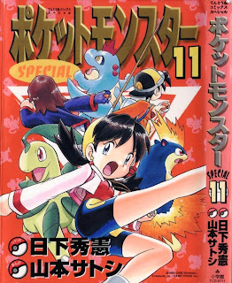 Things are going fairly fast, heh:
- Chapter 130: Vs. Suicune Part 1 - -reichiru-
- Chapter 131: Vs. Suicune Part 2 - Simon
- Chapter 132: Vs. Suicune Part 3 - Hiroko
- Chapter 133: Vs. Azumarill - SoaringSomeone
- Chapter 134: Vs. Heracross - link
- Chapter 135: Vs. Larvitar - -reichiru-
- Chapter 136: Vs. Crobat - link
- Chapter 137: Vs. Raikou & Entei Part 1 - Simon
- Chapter 138: Vs. Raikou & Entei Part 2 - Simon
- Chapter 139: Vs. Raichu - Simon
- Chapter 140: Vs. Dodrio - -reichiru-
- Chapter 141: Vs. Lickitung - -reichiru-
- Chapter 142: Vs. Remoraid - Aerilic
Sunday, October 17, 2010
Pokemon Special vol 10
 Since there's so many members working on this, we'll often be working on multiple volumes at once.
- Chapter 117: Vs. Slugma - -reichiru-
- Chapter 118: Vs. Chikorita - Hiroko
- Chapter 119: Vs. Flaaffy - Simon
- Chapter 120: Vs. Staryu - Aerilic
- Chapter 121: Vs. Corsola - zdraconicespeon
- Chapter 122: Vs. Qwilfish - Pikachu
- Chapter 123: Vs. Dragonair - Hiroko
- Chapter 124: Vs. Skarmory - Shincario
- Chapter 125: Vs. Misdreavus - -reichiru-
- Chapter 126: Vs. Jumpluff - Simon
- Chapter 127: Vs. Miltank - zdraconicespeon
- Chapter 128: Vs. Ditto - SoaringSomeone
- Chapter 129: Vs. Girafarig - Aerilic
Saturday, October 16, 2010
More Typesetting
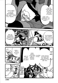 Clearly, "center" and "consistent font size" are too vague, so let me elaborate:
- A small number of font sizes: 90% of my text are of size 14, 16, 18, 24 or 36; the only sizes used in the example above are 14 and 18 (actually 30 and 36 because the raw was twice as high). That means that font size differences are obvious. If you always change the font size to fit the bubble, you'll waste a lot of your time and energy, and the reader will get slightly font-sick from adjusting to varying font sizes.
- The right size and style: That said, don't always use the same font style and size, such as what Chuang Yi does. Use BoldItalic for shouting and spiky bubbles! And if you have enough room, change the font size as well! Put emphasis on the style.
- Separate the text: Make sure that text from different text bubbles are distinguishable from each other, especially if they're next to each other.
One tactic is to vertically nudge the text so that it's half of a line below its neighbors. I know that's not very clear, so look at the giant compound bubble that Pearl has in the lower right of the example. Notice how each piece of text doesn't really line up with its neighbors.
Also, don't be afraid to leave a good, large margin between each piece of text. You can use the Outer Glow style if it goes out of the text bubble, which brings me to: - Use Outer Glow: Life will be hard for you if you kept confining your text in the text bubbles. Use the Outer Glow style if the text is comes close or goes over the edge. The text bubble "we've underestimated..." wouldn't have looked as good if it didn't have the Outer Glow.
I can understand your intentions to preserve the lovely art, but it honestly looks worse if we gave the page a bad typeset. - Use proper case: As hard as it is to see, WildWords is a case-sensitive font. That means that the glyphs it uses for upper- and lowercase characters are different. The best example is upper- and lowercase "I". I encourage you to type with normal capitalization and casing, since it's the best way to keep your text consistent.
- (Update) Use your enter key: Oh, and I forgot about an important one. In general, you don't want to just copy it in and call the piece of text finished. No, no, no.
You would want to move some text over to the next line by, well, pressing your enter key (inserting a newline to be technical). Here's the upper-left bubble of the example without any newline. See how ugly it is? One newline between "miss" and "is" can change a lot. Use the newline to shape your text, especially away from the edge and from other pieces of text.
Pokemon Special vol 9

Alright, let's start. Here are your assigned chapters:
- Chapter 104: Vs. Ariados - Aerilic
- Chapter 105: Vs. Smeargle - Pikachu
- Chapter 106: Vs. Sudowoodo - Hiroko
- Chapter 107: Vs. Gligar - Simon
- Chapter 108: Vs. Quilava - SoaringSomeone
- Chapter 109: Vs. Ampharos - -reichiru-
- Chapter 110: Vs. Piloswine - -reichiru-
- Chapter 111: Vs. Tyranitar - zdraconicespeon
- Chapter 112: Vs. Red Gyrados - link
- Chapter 113: Vs. Delibird 1 - zdraconicespeon
- Chapter 114: Vs. Delibird 2 - Shincario
- Chapter 115: Vs. Forretress - Hiroko
- Chapter 116: Vs. Scizor - Simon
Go forth and copy!
Thursday, October 14, 2010
Straightening and Cloning
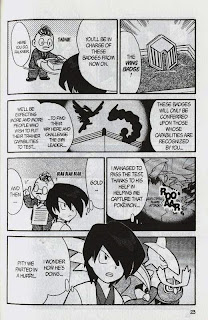
One last tutorial before we start. The page used for this tutorial is page 23 from volume 9:
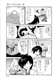 Not needed, but here's the Chuang Yi page anyways:
 Straightening
Now, if you have read through the raws, you may have noticed that the not-so-diligent scanner didn't straighten the pages. We'll have to do that for ourselves.
This method isn't recommended for proper raws (like, raws I've scanned myself) because it changes the canvas size. However, the difference is only visible to people with OCD, like me, so it's worth the efficiency. If you do end up doing cleaning and editing in the future, the normal way is just to rotate and proportionally scale the image; nevertheless, this way is pretty much instant compared to the normal way.
Open up PS and right-click the eyedropper tool (I). Select the ruler tool:
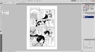 Draw a ruler vertically or horizontally, it doesn't matter. Stick as close to the line you choose as your reference as much as possible. You may have to disable Snap under View -> Snap (Shift+Ctrl+;).
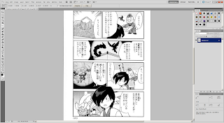 Press the "Straighten" button on the second button from the top, then it should rotate and crop the page for you. If it doesn't look right, try again using a different edge.
 Cloning
Now, sometimes, there might be text that are in places that you can't just paint over. Take, for example, this text bubble in the flashback. I would actually accept the page if you don't do it at all, since it's not very significant, but if you have enough free time, you could try cloning it.
Since we're going to do work on the background, I would recommend that you clone the layer first.
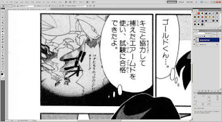 This guide by the immortal scanlation group Storm In Heaven pretty much covers it all, so I'm not going to repeat them. Select the clone stamping tool (S), then where you want to clone while pressing down the Alt key. The brush works exactly like a normal brush, except that it copies over the image from where you selected. The location of where you copy from moves along with your brush.
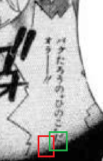
I recommend that you choose from just left of where the text in the flashback bubble clips into the larger bubble for the flashback (red rectangle). Starting from the green rectangle, work your way up. Don't be afraid to choose new sources for clone stamping.
 Eventually you'll clean all of it:
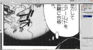 And now you can clean and typeset like normal:
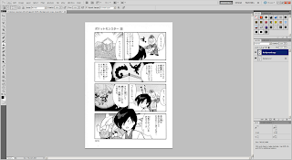
New to Photoshop CS5 is a feature called content-aware fill. It only really works well in certain cases. You can try it out, but good ol' clone stamp is good enough.
When to Clone Stamp
Don't do clone stamp every single time. For example, the title on the page used for Typesetting 101 would've taken me 15-30 minutes to clean. Use your judgment to decide whether to put the translation next to it or clean it with clone stamp.
Merging Spreads
One final point I would like to make is about 2-page spreads. As of right now, don't merge them yourselves. Just treat the two pages separately. I'll merge them after you submit your chapter to me.
Final Test
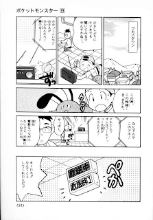
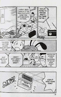
Alright, take a shot at this final test (page 31). Straighten and clean the broadcast sign, then typeset it.
In regards to styling, use the font Champagne & Limousines (because it's a narrow font, it can fit better inside the vertically-orientated box) for labels that display the location, italicized WildWords for announcement text, and Syntax LT for the broadcast sign. All of them should have been included in the font pack. I should have the styling guideline hammered out before we start so that our releases can be more or less consistent:
 Not needed, but here's the Chuang Yi page anyways:
 Straightening
Now, if you have read through the raws, you may have noticed that the not-so-diligent scanner didn't straighten the pages. We'll have to do that for ourselves.
This method isn't recommended for proper raws (like, raws I've scanned myself) because it changes the canvas size. However, the difference is only visible to people with OCD, like me, so it's worth the efficiency. If you do end up doing cleaning and editing in the future, the normal way is just to rotate and proportionally scale the image; nevertheless, this way is pretty much instant compared to the normal way.
Open up PS and right-click the eyedropper tool (I). Select the ruler tool:
 Draw a ruler vertically or horizontally, it doesn't matter. Stick as close to the line you choose as your reference as much as possible. You may have to disable Snap under View -> Snap (Shift+Ctrl+;).
 Press the "Straighten" button on the second button from the top, then it should rotate and crop the page for you. If it doesn't look right, try again using a different edge.
 Cloning
Now, sometimes, there might be text that are in places that you can't just paint over. Take, for example, this text bubble in the flashback. I would actually accept the page if you don't do it at all, since it's not very significant, but if you have enough free time, you could try cloning it.
Since we're going to do work on the background, I would recommend that you clone the layer first.
 This guide by the immortal scanlation group Storm In Heaven pretty much covers it all, so I'm not going to repeat them. Select the clone stamping tool (S), then where you want to clone while pressing down the Alt key. The brush works exactly like a normal brush, except that it copies over the image from where you selected. The location of where you copy from moves along with your brush.
I recommend that you choose from just left of where the text in the flashback bubble clips into the larger bubble for the flashback (red rectangle). Starting from the green rectangle, work your way up. Don't be afraid to choose new sources for clone stamping.
 Eventually you'll clean all of it:
 And now you can clean and typeset like normal:
New to Photoshop CS5 is a feature called content-aware fill. It only really works well in certain cases. You can try it out, but good ol' clone stamp is good enough.
When to Clone Stamp
Don't do clone stamp every single time. For example, the title on the page used for Typesetting 101 would've taken me 15-30 minutes to clean. Use your judgment to decide whether to put the translation next to it or clean it with clone stamp.
Merging Spreads
One final point I would like to make is about 2-page spreads. As of right now, don't merge them yourselves. Just treat the two pages separately. I'll merge them after you submit your chapter to me.
Final Test
Alright, take a shot at this final test (page 31). Straighten and clean the broadcast sign, then typeset it.
In regards to styling, use the font Champagne & Limousines (because it's a narrow font, it can fit better inside the vertically-orientated box) for labels that display the location, italicized WildWords for announcement text, and Syntax LT for the broadcast sign. All of them should have been included in the font pack. I should have the styling guideline hammered out before we start so that our releases can be more or less consistent:


Wednesday, October 13, 2010
Typesetting 101
Let's start, shall we? The most common task you, as a member of the Pokemon Special Restoration Project will be performing is typesetting. It's the act of putting the text on the page.
All of the fonts for this project can be downloaded here.
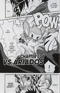
The page I'll be using for this tutorial is page 6 of volume 9:
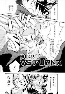 Chuang Yi's translation:
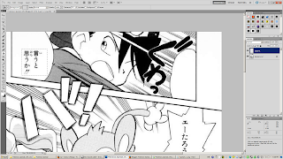
Let's open the Japanese raw up in Photoshop (CS5 in my case). Your layout may be different; I find this layout to suit me the best, but you can try different ones. Nevertheless, I recommend that you at least have the Layers, Character and Styles tabs.
 Start by adding a new layer (second button from the bottom right on the Layers tab). You'll keep the original layer as is, and add white regions over it to cover the Japanese text up. Use the rectangle tool (M) or the lasso tool (L) to select the area, then use the paint bucket tool (G; you'll have to change it to the paint bucket from the gradient tool manually) to make the selected area white:
 It should look like this in the end:

Switch over to the text tool (T) and start making text bubbles (well, rectangles). For now, just set the font to good ol' WildWords and the font size to 14px.
Notice how I match up the text to the crosshair at the center of the bubble to center the text. While that does a pretty good estimate, you might have to also move the whole text layer around (V) to make it look correctly aligned. Use your judgment:
 Keep on copying over the text. You might have to break the line (i.e. between "you've" and got") to keep the text from going out of bounds:

The final product for now. Note that in the bottom two text bubbles, the tildes (~) look weird. That's because WildWords doesn't support tildes, so Photoshop inserts the tilde with its default font. Therefore, type out the whole text without the tilde ("AAAH!!"), then go back and insert the tilde:
 It looks...dead. We'll have to spice the typesetting up. The most common convention is by making the loud or shouting text, usually in spiky text bubbles into Bold Italic:
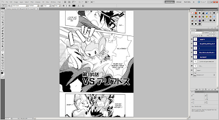 Hmm, still doesn't cut it. Let's also make the text larger. I changed the font size for the shouting to 24:
 The text now clips into the surrounding area, but that's okay. Go to Layer -> Layer Style -> Outer Glow. Set the settings like below. The text will still go out of bounds, but it's legible. Some people don't let the text go out of bounds at all; it's just my opinion that this looks better. However, don't spam this style too much, especially for normal dialogue unless the text bubble is just too small.
It would take too much work to do this for every single time the text clips out, so save the style using the "New Style..." button. It should appear in the Styles tab.
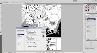 Something is still missing, though. It's not very clear in this page, but the Masked Man's voice uses a different font. Thus, we need to change the font as well. The default font for evil voices is "Manga Temple":

Once you switch the text over to Manga Temple, however, you might notice that the styling is turned back to normal. That's because Manga Temple doesn't have a Bold Italic option by default. However, if you go into the Character tab, you can force the font to be turned into bold and italic with their corresponding buttons:
 Now, our page is finished. Well, I inserted the title "Vs. Ariados" afterward, but it's just another text bubble with Outer Glow. The font for that kind of "sign" is Syntax LT.
 For this project, don't worry about removing the Japanese text such as titles and sound effects if it's just too embedded into the page. We don't have an army of editors and cleaners to do that. If you really want to do so, you could put the sound effects in the margins.
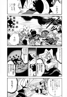
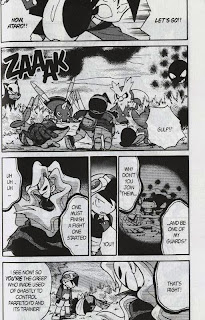
Now, try it for yourself on page 7, and post your results in the comments:
All of the fonts for this project can be downloaded here.
The page I'll be using for this tutorial is page 6 of volume 9:
 Chuang Yi's translation:
Let's open the Japanese raw up in Photoshop (CS5 in my case). Your layout may be different; I find this layout to suit me the best, but you can try different ones. Nevertheless, I recommend that you at least have the Layers, Character and Styles tabs.
 Start by adding a new layer (second button from the bottom right on the Layers tab). You'll keep the original layer as is, and add white regions over it to cover the Japanese text up. Use the rectangle tool (M) or the lasso tool (L) to select the area, then use the paint bucket tool (G; you'll have to change it to the paint bucket from the gradient tool manually) to make the selected area white:
 It should look like this in the end:
Switch over to the text tool (T) and start making text bubbles (well, rectangles). For now, just set the font to good ol' WildWords and the font size to 14px.
Notice how I match up the text to the crosshair at the center of the bubble to center the text. While that does a pretty good estimate, you might have to also move the whole text layer around (V) to make it look correctly aligned. Use your judgment:
 Keep on copying over the text. You might have to break the line (i.e. between "you've" and got") to keep the text from going out of bounds:
The final product for now. Note that in the bottom two text bubbles, the tildes (~) look weird. That's because WildWords doesn't support tildes, so Photoshop inserts the tilde with its default font. Therefore, type out the whole text without the tilde ("AAAH!!"), then go back and insert the tilde:
 It looks...dead. We'll have to spice the typesetting up. The most common convention is by making the loud or shouting text, usually in spiky text bubbles into Bold Italic:
 Hmm, still doesn't cut it. Let's also make the text larger. I changed the font size for the shouting to 24:
 The text now clips into the surrounding area, but that's okay. Go to Layer -> Layer Style -> Outer Glow. Set the settings like below. The text will still go out of bounds, but it's legible. Some people don't let the text go out of bounds at all; it's just my opinion that this looks better. However, don't spam this style too much, especially for normal dialogue unless the text bubble is just too small.
It would take too much work to do this for every single time the text clips out, so save the style using the "New Style..." button. It should appear in the Styles tab.
 Something is still missing, though. It's not very clear in this page, but the Masked Man's voice uses a different font. Thus, we need to change the font as well. The default font for evil voices is "Manga Temple":
Once you switch the text over to Manga Temple, however, you might notice that the styling is turned back to normal. That's because Manga Temple doesn't have a Bold Italic option by default. However, if you go into the Character tab, you can force the font to be turned into bold and italic with their corresponding buttons:
 Now, our page is finished. Well, I inserted the title "Vs. Ariados" afterward, but it's just another text bubble with Outer Glow. The font for that kind of "sign" is Syntax LT.
 For this project, don't worry about removing the Japanese text such as titles and sound effects if it's just too embedded into the page. We don't have an army of editors and cleaners to do that. If you really want to do so, you could put the sound effects in the margins.
Now, try it for yourself on page 7, and post your results in the comments:


Subscribe to:
Comments (Atom)