Clearly, "center" and "consistent font size" are too vague, so let me elaborate:
- A small number of font sizes: 90% of my text are of size 14, 16, 18, 24 or 36; the only sizes used in the example above are 14 and 18 (actually 30 and 36 because the raw was twice as high). That means that font size differences are obvious. If you always change the font size to fit the bubble, you'll waste a lot of your time and energy, and the reader will get slightly font-sick from adjusting to varying font sizes.
- The right size and style: That said, don't always use the same font style and size, such as what Chuang Yi does. Use BoldItalic for shouting and spiky bubbles! And if you have enough room, change the font size as well! Put emphasis on the style.
- Separate the text: Make sure that text from different text bubbles are distinguishable from each other, especially if they're next to each other.
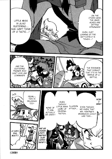
One tactic is to vertically nudge the text so that it's half of a line below its neighbors. I know that's not very clear, so look at the giant compound bubble that Pearl has in the lower right of the example. Notice how each piece of text doesn't really line up with its neighbors.
Also, don't be afraid to leave a good, large margin between each piece of text. You can use the Outer Glow style if it goes out of the text bubble, which brings me to:
- Use Outer Glow: Life will be hard for you if you kept confining your text in the text bubbles. Use the Outer Glow style if the text is comes close or goes over the edge. The text bubble "we've underestimated..." wouldn't have looked as good if it didn't have the Outer Glow.
I can understand your intentions to preserve the lovely art, but it honestly looks worse if we gave the page a bad typeset.
- Use proper case: As hard as it is to see, WildWords is a case-sensitive font. That means that the glyphs it uses for upper- and lowercase characters are different. The best example is upper- and lowercase "I". I encourage you to type with normal capitalization and casing, since it's the best way to keep your text consistent.
- (Update) Use your enter key: Oh, and I forgot about an important one. In general, you don't want to just copy it in and call the piece of text finished. No, no, no.
You would want to move some text over to the next line by, well, pressing your enter key (inserting a newline to be technical). Here's the upper-left bubble of the example without any newline. See how ugly it is? One newline between "miss" and "is" can change a lot.
 Use the newline to shape your text, especially away from the edge and from other pieces of text.
It's clear that I forgot how long it takes to learn typesetting. Don't worry,
my first edits weren't any better. Put your requests for comments here instead of the volume 9 comments section.
 Clearly, "center" and "consistent font size" are too vague, so let me elaborate:
http://i52.tinypic.com/rbyxog.png
ReplyDeleteLooking at all the stuff you've pointed out, that's what I've come up with. Now to go fix the other pages I started doing. ^^;
http://i54.tinypic.com/2rggwhz.png
ReplyDeleteForgot the credits, so here's the edited version.
Good, good, you've got it. My only complaint would be the font size of the lower left bubble, but that's acceptable as it is with bold-italic.
ReplyDeletehttp://img824.imageshack.us/img824/7195/pokemonspecialv09080.png
ReplyDeleteHey, on this page, where should I put the VS. Quilava? I kinda just smooshed it in at the bottom, but it looks a little off to me.
Also, do you have any other critiques?
That layout is good. One other suggestion to make standalone punctuation (the "?" in the upper left) larger, but whatever.
ReplyDeleteI had to do all of this during this weekend since I have practically no more time at all until next weekend to do any of it.
ReplyDeletehttp://dl.dropbox.com/u/149061/c107.zip
Oh yeah, SoaringSomeone, in case you haven't yet, don't forget to do Page 79, since that's technically the first page of your chapter.
ReplyDeleteAlright, that passes, but if you're serious about sound effects, you can look up this site to translate some of them:
ReplyDeletehttp://thejadednetwork.com/sfx/
Otherwise, go to chapter 116.
ReplyDeleteThanks for the link! I went back and changed the ones that weren't translated. Same link as before, internal files changed:
ReplyDeletehttp://dl.dropbox.com/u/149061/c107.zip
Good, good
ReplyDeleteOkay, here's chapter 112.
ReplyDeletehttp://ifile.it/syjf2v9
112 and 104 passes!
ReplyDeleteWait, zdraconicespeon, you did the wrong chapter. You were supposed to do 111... Work it out with link somehow.
ReplyDeleteActually, I DID to chapter 111, I just put 112 on... well, everything. xDD I'll go fix that.
ReplyDeleteOkay, Chapter 111.
ReplyDeletehttp://ifile.it/x7p94wn
Oh, cool
ReplyDeleteDone with 108, vs. Quilava.
ReplyDeletehttp://ifile.it/71i36tf
If it's not too much, go back and straighten your pages.
ReplyDeletehttp://ifile.it/1x356dk
ReplyDeleteChapter 121 finished. =3
I'm zdraconicespeon, btw. If you couldn't guess.
ReplyDeleteSure. Didn't even notice that they were crooked.
ReplyDelete(I accidentally named the file chapter 118, but it's chapter 108.)
http://ifile.it/0k2o3tl
Both passed!
ReplyDelete