All of the fonts for this project can be downloaded here.
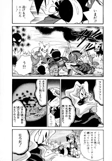
The page I'll be using for this tutorial is page 6 of volume 9:
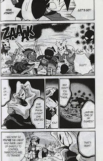
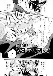 Chuang Yi's translation:
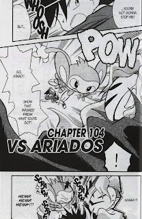
Let's open the Japanese raw up in Photoshop (CS5 in my case). Your layout may be different; I find this layout to suit me the best, but you can try different ones. Nevertheless, I recommend that you at least have the Layers, Character and Styles tabs.
 Start by adding a new layer (second button from the bottom right on the Layers tab). You'll keep the original layer as is, and add white regions over it to cover the Japanese text up. Use the rectangle tool (M) or the lasso tool (L) to select the area, then use the paint bucket tool (G; you'll have to change it to the paint bucket from the gradient tool manually) to make the selected area white:
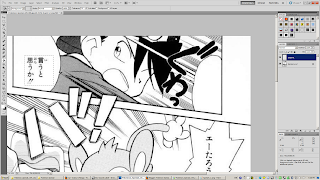 It should look like this in the end:
Switch over to the text tool (T) and start making text bubbles (well, rectangles). For now, just set the font to good ol' WildWords and the font size to 14px.
Notice how I match up the text to the crosshair at the center of the bubble to center the text. While that does a pretty good estimate, you might have to also move the whole text layer around (V) to make it look correctly aligned. Use your judgment:
 Keep on copying over the text. You might have to break the line (i.e. between "you've" and got") to keep the text from going out of bounds:
The final product for now. Note that in the bottom two text bubbles, the tildes (~) look weird. That's because WildWords doesn't support tildes, so Photoshop inserts the tilde with its default font. Therefore, type out the whole text without the tilde ("AAAH!!"), then go back and insert the tilde:
 It looks...dead. We'll have to spice the typesetting up. The most common convention is by making the loud or shouting text, usually in spiky text bubbles into Bold Italic:
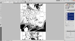 Hmm, still doesn't cut it. Let's also make the text larger. I changed the font size for the shouting to 24:
 The text now clips into the surrounding area, but that's okay. Go to Layer -> Layer Style -> Outer Glow. Set the settings like below. The text will still go out of bounds, but it's legible. Some people don't let the text go out of bounds at all; it's just my opinion that this looks better. However, don't spam this style too much, especially for normal dialogue unless the text bubble is just too small.
It would take too much work to do this for every single time the text clips out, so save the style using the "New Style..." button. It should appear in the Styles tab.
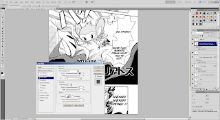 Something is still missing, though. It's not very clear in this page, but the Masked Man's voice uses a different font. Thus, we need to change the font as well. The default font for evil voices is "Manga Temple":
Once you switch the text over to Manga Temple, however, you might notice that the styling is turned back to normal. That's because Manga Temple doesn't have a Bold Italic option by default. However, if you go into the Character tab, you can force the font to be turned into bold and italic with their corresponding buttons:
 Now, our page is finished. Well, I inserted the title "Vs. Ariados" afterward, but it's just another text bubble with Outer Glow. The font for that kind of "sign" is Syntax LT.
 For this project, don't worry about removing the Japanese text such as titles and sound effects if it's just too embedded into the page. We don't have an army of editors and cleaners to do that. If you really want to do so, you could put the sound effects in the margins.
Now, try it for yourself on page 7, and post your results in the comments:
i'd love to post my results here, but i'm not really sure how
ReplyDelete:/
http://i14.photobucket.com/albums/a318/elventine/Pokemon_Special_v09_007.jpg
ReplyDelete:D
Aerilic>thank you!
ReplyDelete/a/non> http://i1197.photobucket.com/albums/aa437/Lv100Pikachu/anon%20purposes/practice1-pikachu.jpg
Yay! :D
ReplyDeleteI was wondering, should we save these in .jpg or .png? Is one preferred over the other?
Here's my try~ http://i388.photobucket.com/albums/oo328/Hirokosh/try.png
ReplyDeletePNG is preferred because it's better with greyscale/indexed. JPEG is used for color pages. It doesn't matter right now, but yea, the final product for non-color pages will be PNG.
ReplyDeleteOne note I would like to make is to not max out the font size every time. Keep the font size consistent and smaller so you have more room in tighter spaces. I think that I changed the DPI so that 14px works the best, but use your own judgment.
They're all pretty good; I would say that you're all qualified for 90% of the pages, the other 10% being page merges and things that require clone stamping. I might put up more tutorials while more people join in, then we'll start for real.
My try.
ReplyDeleteMy god this takes forever xD with my schedule I might be able to do a chapter a week at best. How do you manage to produce a chapter every two days?
http://img718.imageshack.us/img718/5582/pokemonspecialv09007nq8.png
Well, the lack of difficult courses and a social life helps.
ReplyDeleteDon't worry, you'll become more efficient as you release more and more chapters.
http://i.imgur.com/LDlrU.png
ReplyDeleteHaha. That was a bit different than cleaning. Nice change of pace.
Well there's my problem... I'm taking 5 APs and I have College Applications to finish this semester... I'll probably have time to churn out more after the New Years.
ReplyDeleteBut you're right, it gets faster. I managed to churn out these two in about the time it took me to do the first one:
http://img815.imageshack.us/img815/8208/pokemonspecialv09008nq8.png
http://img87.imageshack.us/img87/6720/pokemonspecialv09009nq8.png
Excellent, 5 members now. Well, APs were easy for me, though I never took more than 3. I spent all of my junior year slaving away, studying APUSH, and then I found out that to get a 5 you'll only need to get something around 110 out of 170 points. But whatever, don't let me distract you. Take it at your own pace.
ReplyDeleteSo how this will most likely work is that each person gets a chapter I assign. We'll only release once a volume is finished. Don't worry about your own speed; with these numbers, as long as we chip away, we'll eventually finish. At five members, the 270 chapters (well, less, because that's from volume 9 to volume 32), each member will do around 50 chapters. If each member does at least one chapter a week, we'll finish in a year.
Volumes 9-32 is 261 chapters. Volumes 9-27 works out to be 214 chapters, divided by 5 people works out to be nearly 43 chapters per person.
ReplyDeleteOh yeah, one question: will we be using the proper names for Green/Blue, or will we be using the switched version?
ReplyDeleteOh, that's good to know.
ReplyDeleteWe will be using the Japanese convention (Green = rival, Blue = girl).
http://i83.photobucket.com/albums/j285/yumiko999/pokespe.png
ReplyDeleteMy try ^^ Just to let you know, I can usually finish typesetting around 15 pages per hour if there's no major cloning involved. Perhaps a bit less, cause I usually have bubbles all cleaned for me when I typeset haha~
Oh yeah, I also noticed that the pages are a bit crooked, we should fix that also?
ReplyDeleteI noticed that about the pages as well. I guess we should fix that, though that means bogging down the efficiency and clipping out a bit of the pages.
ReplyDeleteHere's my attempt http://img40.imageshack.us/img40/5988/pokemonspecialv09007.png
ReplyDeleteSorry if it's bad.
http://img218.imageshack.us/img218/1479/pokemon specialv09pg07.png
ReplyDeleteKinda fun. Doesn't seem to take too horribly long. Once I get the hang of it, I think it'll go pretty quickly.
I used GIMP, but I was able to figure out everything I needed to do. The only thing I'm not sure I could do is using bold or italics or both in certain cases, because GIMP considers [fontname] BOLD to be a separate font, and some don't come in bold, italics, or both. For instance, Manga Temple didn't come in both for whatever reason, but WildWords did.
Oh I know of a good way to rotate the pages without clipping anything.
ReplyDeleteGo to the eyedropper tool, right click and you will see a measure tool. Now find a horizontal/vertical line on the page that should be straight (but isn't), and click on it with the measure tool and drag it across the line.
Now go to Image>Rotate Canvas>Arbitrary and a box will pop-up with a value already inputted. Click OK and the page should rotate straight by itself. This method doesn't crop any corners off at all ^^ For any transparent spaces, just create a new layer underneath and fill it with white.
That what I used to do (there should be a "Straighten" button), except that it does crop the edges off by changing the canvas size.
ReplyDeleteWell, it's not like we have a choice, since it looks worse if we keep it crooked. That's what we'll do.
I'll write up one more tutorial (well, I'll just link to SIH's guide) and we'll start.
@Genosect and zdraconicespeon: they're good
Here's mine
ReplyDeletehttp://i1118.photobucket.com/albums/k620/link3710/Translatedpage7.png
@link: try to center the text more, but it's fine otherwise.
ReplyDeletehttp://img140.imageshack.us/img140/61/ps09007.png
ReplyDeleteLooking at that in full view, I realize I could've cleaned that up a LOT better, especially that bottom-right bubble. If you're still looking for helpers, I'll make an attempt on the straightening/cloning page, and maybe come back and redo this particular page.
Yea, try to make sure that your text either maxes out the bubble or doesn't touch it as much. It's pretty good, give the other test a try. The more the merrier.
ReplyDeleteRight, I've given it a go. It was actually pretty fun for my first try. Hope its acceptable~
ReplyDeletehttp://img181.imageshack.us/img181/8318/shincariosample.png
That's pretty good. Go to the second test.
ReplyDeleteWell, I gave it a try. It was fun, so I think I'll enjoy doing this.
ReplyDeletehttp://i54.photobucket.com/albums/g106/Rycr/Pokemon%20Special%20Scanlation/TypesettingTutorial-v09p07.png
Cool. Move on to the next tutorial
ReplyDeleteHere's mine. I made a few differences in the text. Thought it sounded better this way. :P
ReplyDeleteTIME: 21 min (Getting used to using GIMP since my PS kinda went dead. -.-)
http://i1189.photobucket.com/albums/z438/awchern/Pokemon_Special_v09_007clean-2.jpg?t=1289427261
Good, go on to the second tutorial
ReplyDeleteHi! Are there any positions still available?
ReplyDeleteHere's my try...
http://i1192.photobucket.com/albums/aa333/mai_mai0017/Pokemon_Special_v09_031_edit.jpg
http://i1192.photobucket.com/albums/aa333/mai_mai0017/Pokemon_Special_v09_007_edit.jpg
~mai^^
by the way, I can't download the fonts pack that you mentioned, 'cause I don't have winRAR to unzip it, but I managed to find Wildwords and Champagne&Limousines on the net and have downloaded it... but I can't find Syntax LT (gomen! T.T)
ReplyDeleteAnyway, I used Impact instead of Syntax LT for the announcements... I hope it's okay...
~mai^^"
Get 7zip and redo the tests
ReplyDeleteOh, alright! I'm on it! :D
ReplyDeleteHow did I do?
ReplyDeletehttp://i428.photobucket.com/albums/qq9/TwiliChaos/Pokemon_Special_v09_007.png
Use the right fonts
ReplyDeletehttp://img137.imageshack.us/img137/7291/kuroitsumetest.png
ReplyDeleteumm... my try...
ReplyDeletehttp://img593.imageshack.us/img593/5988/pokemonspecialv09007.png
Hmm, both have one or two problems:
ReplyDeleteKuroitsume: Your white isn't completely white (#FFFFFF). You may have forgotten to disable italics for the bottom-right bubble
Black Star: From a glance, I can tell that you're not using proper capitalization.
Those are fairly minor; fix these problems while you're doing the next test.
This comment has been removed by the author.
ReplyDeleteHi! Still recruiting? :d I gave this a shot the moment I saw the ad/sign/thing. ^^;
ReplyDeleteHere's my 'entry' (I hope it ain't bad):
http://img29.imageshack.us/img29/1759/serichan.png
BTW, I use CS4.
~Seri-chan
Are you still recruiting?
ReplyDeleteHere's my try!:
http://i957.photobucket.com/albums/ae51/ThePieceOfCheese/PokeSpec/Pokemon_Special_v09_007trans.png
Font size is a bit big, but there's no other problems. Go to the next test
ReplyDelete